Bringing Bold Confidence to QA Testing for the Next Generation

Crafting a vibrant, approachable identity that resonates with ambitious, tech-driven founders and establishes Lodestone as a leader in QA—culminating in an acquisition by Tech Mahindra.

Role

UX/UI Design Intern

Industry

Software Quality Assurance

Duration

3 months

a cellphone leaning against a wall

Project Overview


Lodestone provides quality analysis for tech-focused companies. Despite their high-profile clients, Lodestone’s brand didn’t resonate with the youthful, visionary founders they aimed to attract. The goal was to rebrand Lodestone to feel bold, confident, and approachable, aligning with their target audience of ambitious young entrepreneurs.


Approach


  1. Research: We conducted extensive primary and secondary research, identifying gaps in Lodestone’s brand presence.

  2. Discovery: The brand lacked an identity that reflected their achievements and future goals, needing a refresh to attract youthful, tech-driven founders.

  3. Define:

    • Voice: Witty, honest, and relatable.

    • Feeling: Proud, relieved, and inspired.

    • Impact: Confident, knowledgeable, and supportive.

  4. Design:

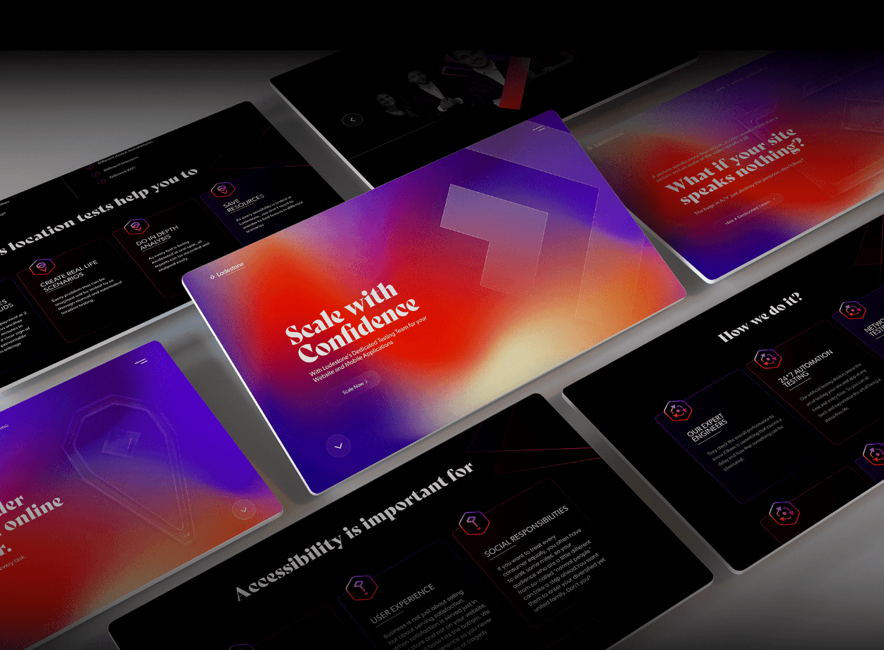
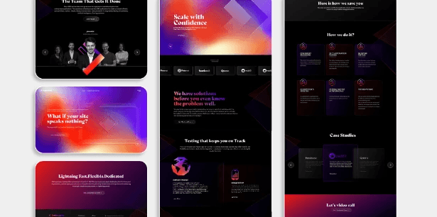
    • Visual Style: Used a neo-glassmorphism aesthetic with vibrant, organic gradients to create a modern, tech-forward identity.

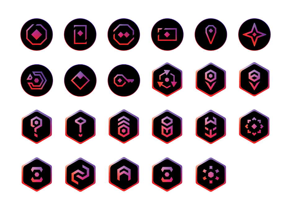
    • Iconography: Created custom icons to simplify Lodestone’s complex offerings, enhancing accessibility and brand presence.

    • Tone of Voice: Crafted a friendly yet knowledgeable tone to appeal to young, ambitious founders.

a cellphone leaning against a wall
a cell phone on a rock

Outcome

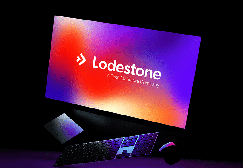
The rebranding transformed Lodestone into a vibrant, approachable brand that balanced technical expertise with youthful energy. Using neo-glassmorphism and organic gradients, we created a visually unique and modern look that made Lodestone feel both quirky and professional. The custom iconography clarified complex offerings, enhancing user accessibility and engagement. This fresh identity resonated with young entrepreneurs, positioning Lodestone as a standout in the QA testing industry. Shortly after the rebranding, Lodestone was acquired by Tech Mahindra, validating the brand’s new direction and demonstrating the impact of a bold, accessible approach.

a cell phone on a bench

Reflection


This project highlighted the importance of making technical brands feel lively and accessible. By using neo-glassmorphism with organic gradients, we created a memorable identity, and self-explanatory icons made complex offerings easy to grasp. I learned the value of early-stage user testing to validate icon and style choices, which I’ll prioritize in future projects to ensure alignment with target audiences. The Lodestone rebranding was a milestone, proving that a “geeky” brand could be bold and quirky—an approach validated by the acquisition by Tech Mahindra, marking a rewarding outcome.

Other projects

Copyright 2024 by Subhankar Saha

Copyright 2024 by Subhankar Saha

Copyright 2024 by Subhankar Saha